Covid 19 course work strategy
The 3 subcategories that will make up the whole project
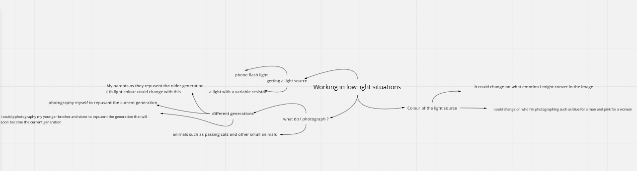
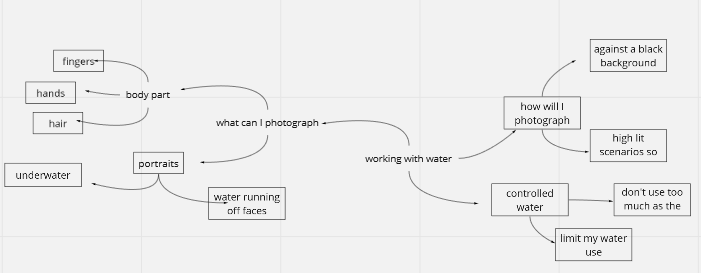
working in low light situations
working with water
going black and white
working with water
going black and white
My idea before looking at photographers and reference photographs
These 3 subcategories will be challenging for me because I never had to work in these conditions except for black and white as I usually have this as part of all my project I have ideas for al 3 of them and how to make them interesting and a plan to edit them with the lack of photoshop.
Working in low light situations
My mindmap of initial ideas
Initial google images research
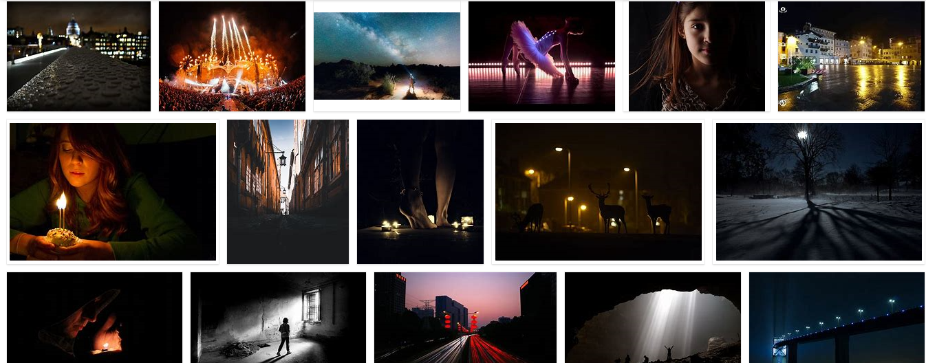
when doing my initial research I notice a thing they all have in common. They all have I focal light source if its from street light or if its from a candle, they all have one primary light source that sets the tone for all of the photograph. I could work a lot with this and will be able to convey a certain emotion or feeling for my image by changing the colour or type of the light used.
Doing research on what path I want to take with this subproject
why do I want to do portrait photography ? well because I never work in low light situations and also I never really take portrait shots so this will give me a challenge to produce interesting while challenging my photography ability. Also I usually photograph building and normal day items so working with portraits will give me a chance to extent my skills as a photographer and also learn new techniques for setting up a photoshoot and also exequting a photoshoot as building don't move and theres no right or wrong way to make a building interreasting while with portraits I have to take into consideration poses, depth of field and also if the lighting makes the image over or under exposed.
Google image research
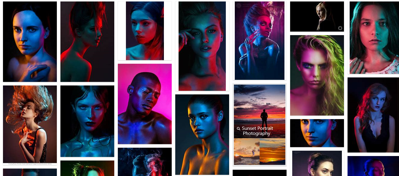
When I was doing research for this part of the project I couldn't find a named photographer who focused on photographs like this so my main source of images is google images. The research didn't come out bad though as the images in the screen shot are exactly what I was looking for, portrait photos with 1 or 2 main light sources that are coloured. I will take inspiration from this and try to product a set of photographs that are clearly influenced from these set of pictures .
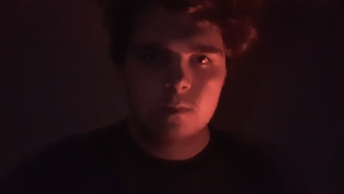
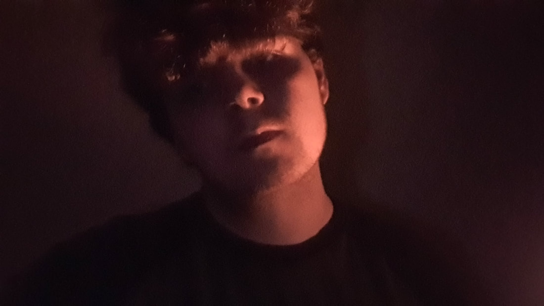
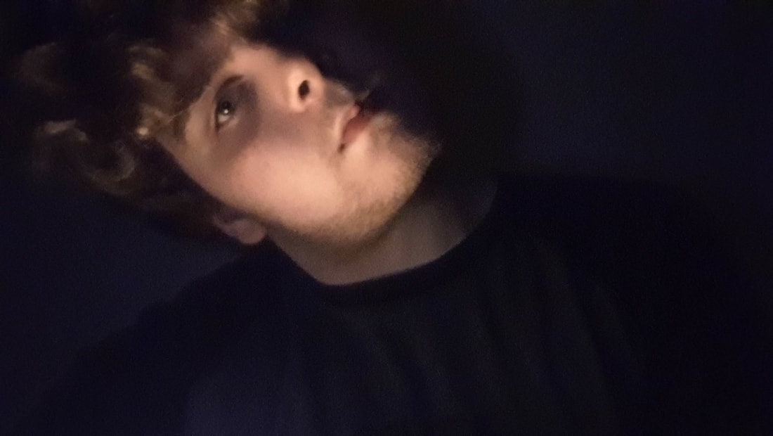
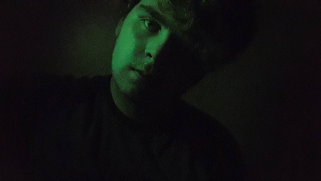
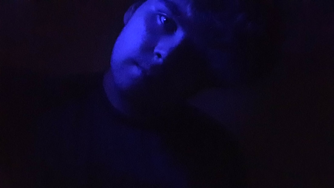
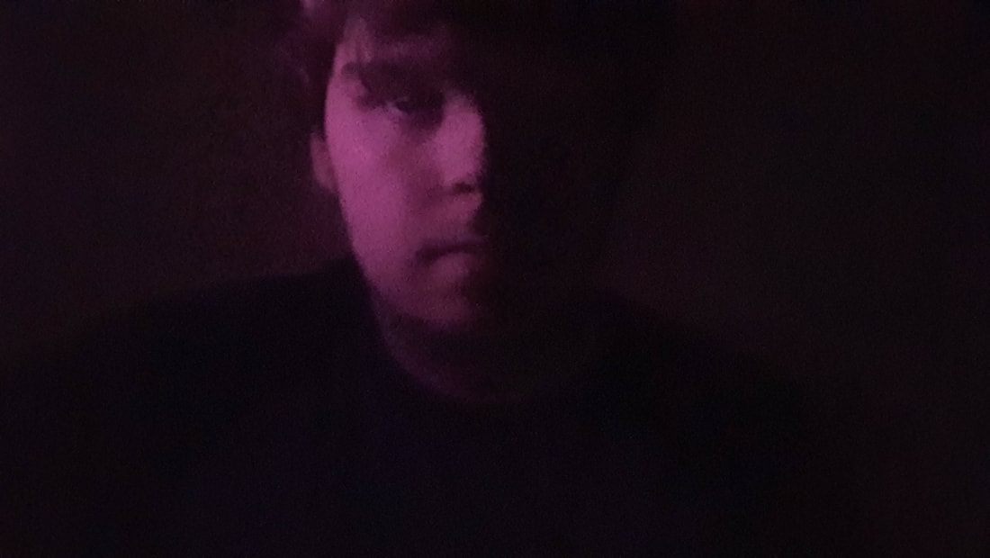
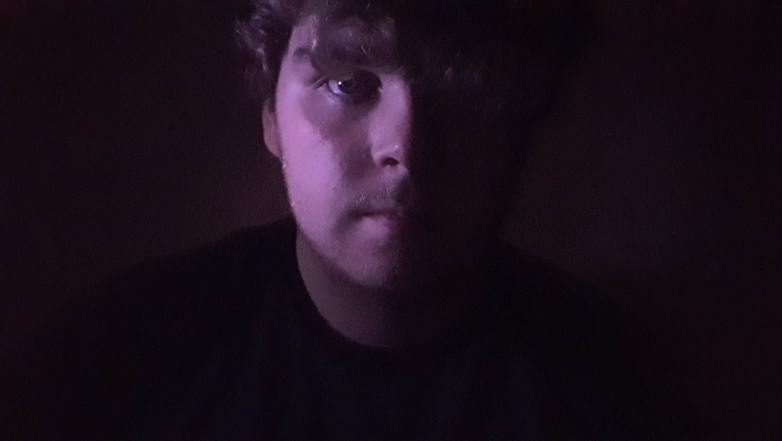
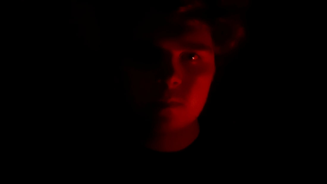
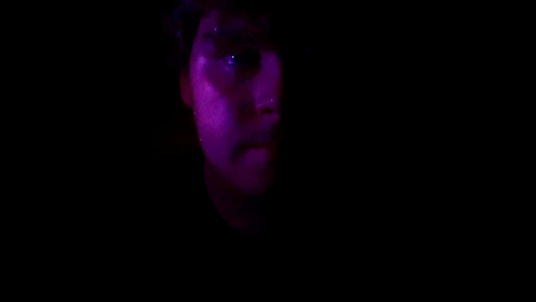
My own low light portrait photographs
What did I learn during that shoot
during this shoot I realised that colours that contrast with my skin tone works best such as, blue, green and red in some cases overall i think that the shoot turned out good and the images in the gallery are ascetically pleasing. Now I will continue to move on to editing these images and making them look a lot more pleasing and giving the images that don't look like they contrast very well looked a lot better.
The edited images of the first shoot
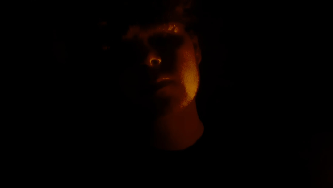
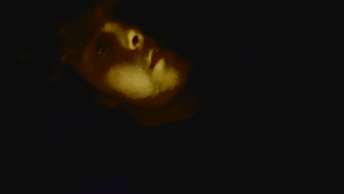
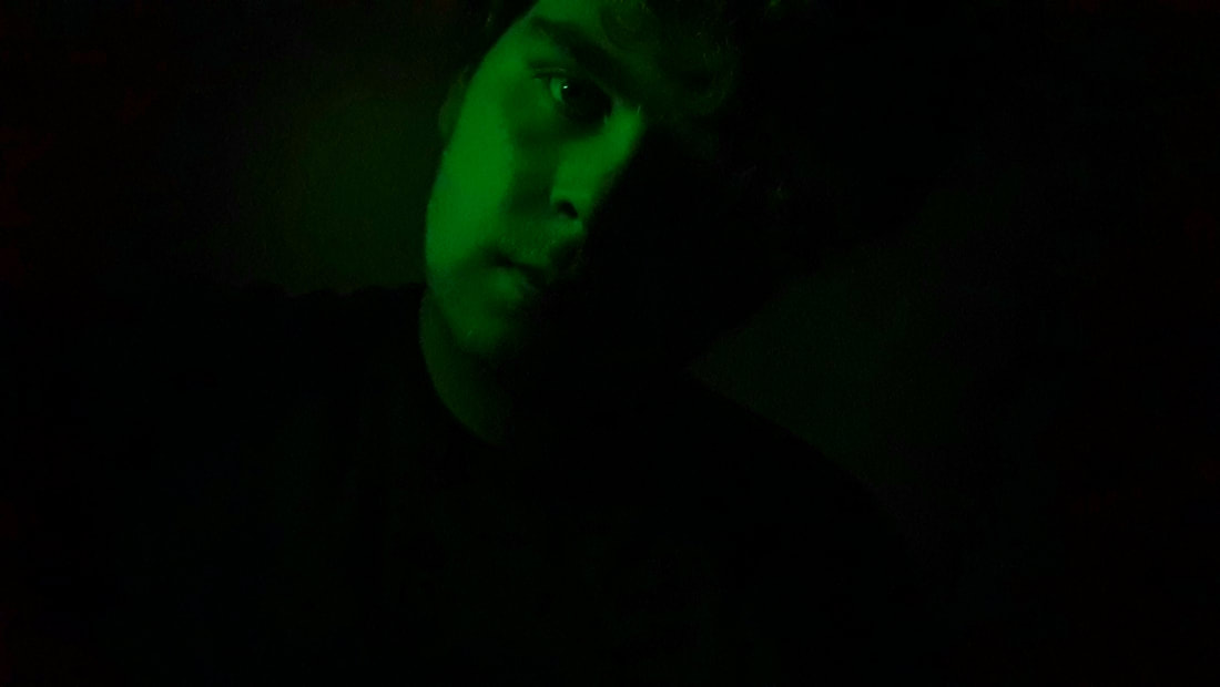
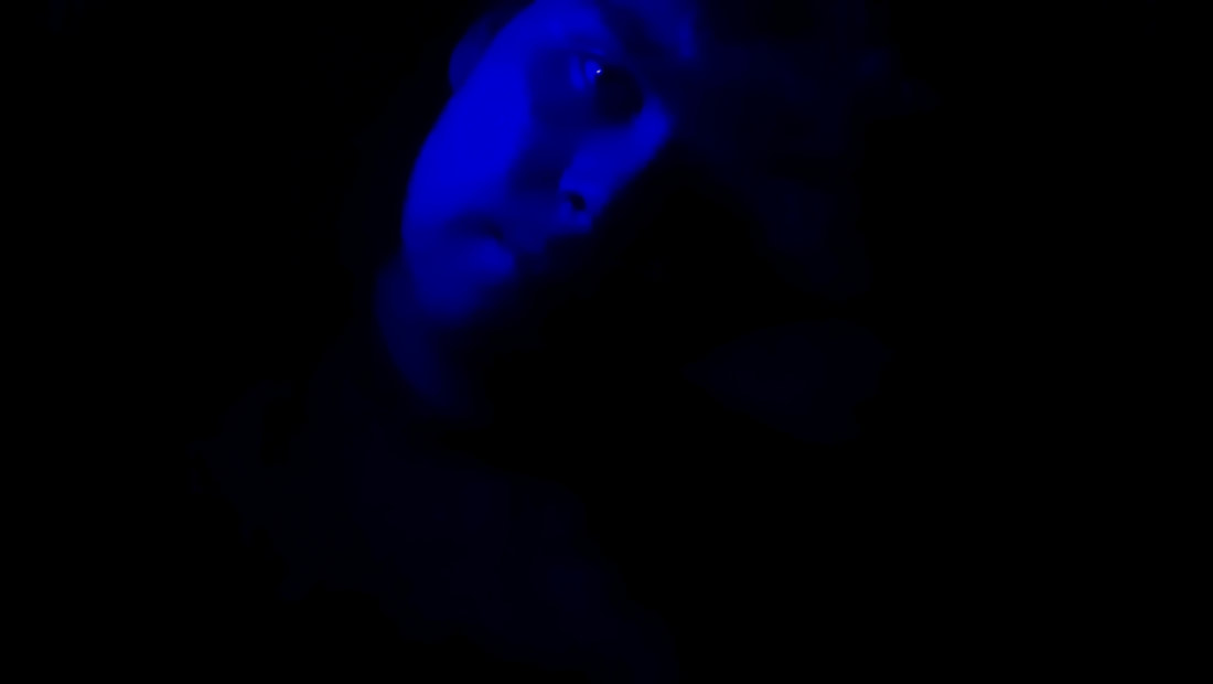
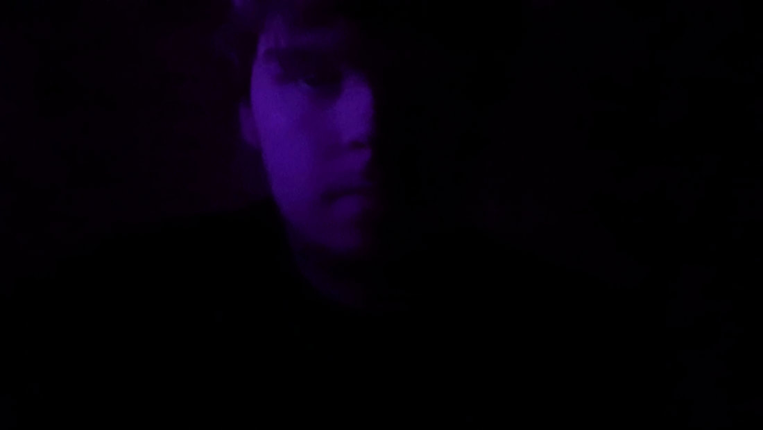
When I was editing these images I had to depend on the editing software that was built into my phone, I could do basic things such as change the brightness and the contrast and turn the image black and white. Luckily I have a relatively new phone so it had a "pro" mode and I was able to lower the aperture to f4 so the light wasn't over exposing my face and then with the built in editing software I was able to turn these images into something nice to look as and at a professional standard. I would turn the brightness down, the exposure down, the contrast up and the saturation I would change on what colour I was trying to show in the image.
Experimenting using colours that contrast to create more interesting photographs
Working with water
My initial mind map of ideas
Why did I choose to work with water
I chose to work with water because I never had to work with it in the past so doing this subproject I will be able to experiment and get used to working with water while doing photography this will give me a challenge while I try to learn the fundamentals and complex ways of photographing water.
Initial google image research
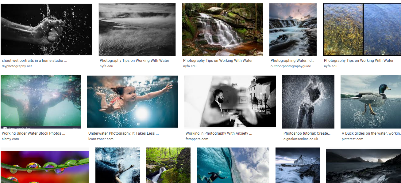
This research isn't exactly what I had in mind as the images aren't taken from inside and don't have the appeal that I want but I can take inspiration from how they were photographed. They were clearly photographed using a high shutter speed and a relatively low iso I can use this in my own photographs to improve their quality.
Named photographer I will take inspiration from
Bill Brandt
Bill Brandt was a British photographer and photojournalist. Although born in Germany, Brandt moved to England, where he became known for his images of British society for such magazine as Lilliput and Picture Post, later he made distorted nudes, portraits of famous artists and landscapes
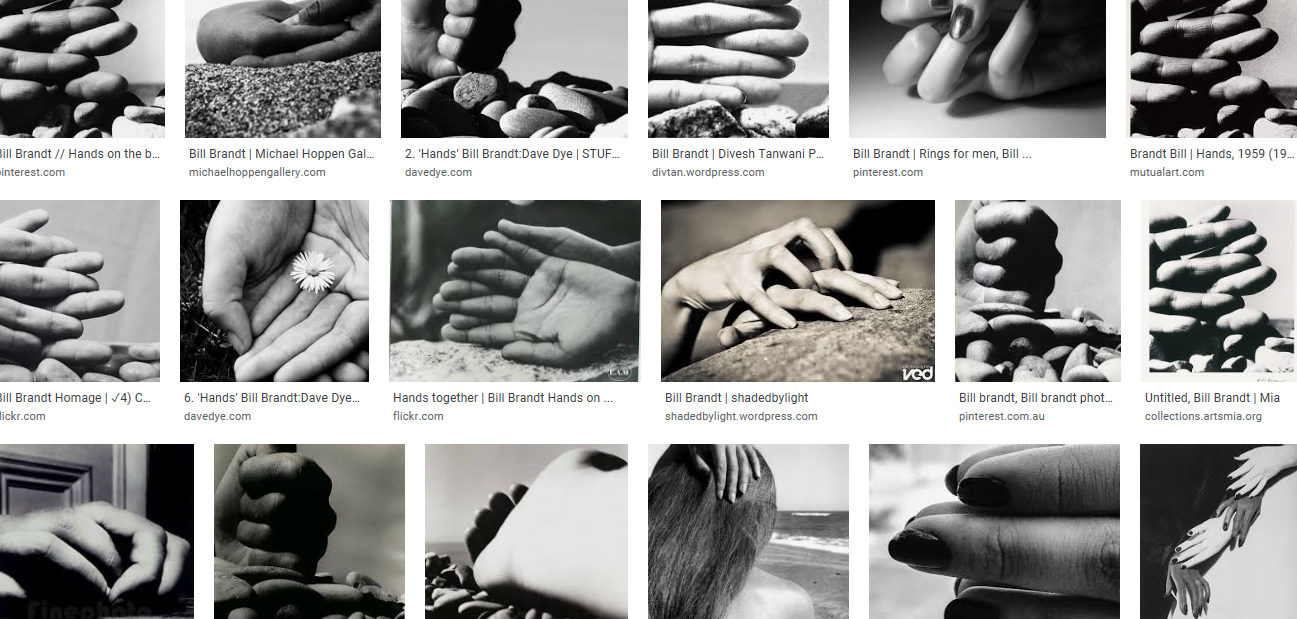
The reason I have chosen Bill Brandt is because his work with hands are very inspiring and I feel like I could make interesting images using the style of photography he does with hands mixed with my own style and water included.
My own work that has been inspired by Bill Brandts hand photography added water
Working in black and white
My mind map of initial ideas
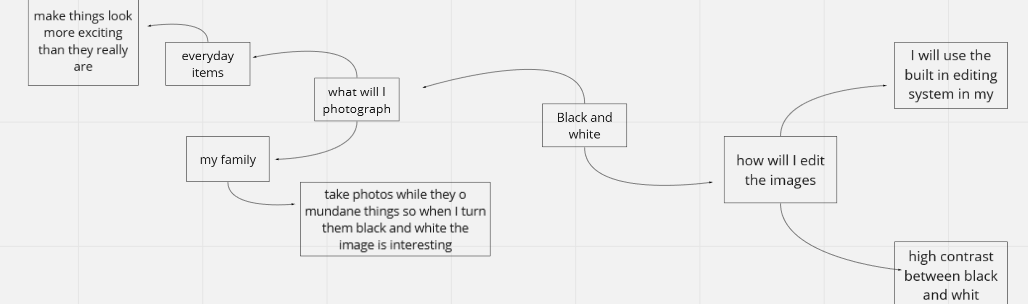
I chose to work with black and white as it gives me the opportunity to produce a set of images that could convey the emotions that people will be feeling during the lock down from Covid-19. The black and white will have a lot of contrast as it will give me an opportunity to have images that are nice to look at.
Initial google images research
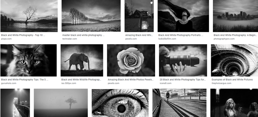
These images are what I was looking for, they all have a high contrast of the black and white and some of them are extremely eye catching. non of them give me inspiration if things I will photograph but they give me the inspiration of how I will edit my images moving on with this subproject.
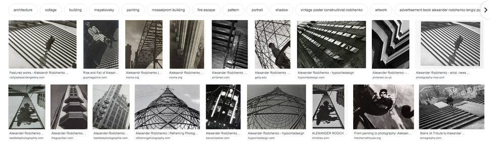
Named photographer research
Alexander Kravchenko's
Aleksander Mikhailovich Rodchenko was a Russian artist, sculptor, photographer and graphic designer. He was one of the founders of constructivism and Russian design; he was married to the artist Varvara Stepanova.
Rodchenko's work was heavily influenced by Cubism and Futurism, as well as by Malevich's Suprematist compositions, which featured geometric forms deployed against a white background. While Rodchenko was a student of Tatlin’s he was also his assistant, and the interest in figuration that characterized Rodchenko's early work disappeared as he experimented with the elements of design. He utilized a compass and ruler in creating his paintings, with the goal of eliminating expressive brushwork.
Rodchenko's work was heavily influenced by Cubism and Futurism, as well as by Malevich's Suprematist compositions, which featured geometric forms deployed against a white background. While Rodchenko was a student of Tatlin’s he was also his assistant, and the interest in figuration that characterized Rodchenko's early work disappeared as he experimented with the elements of design. He utilized a compass and ruler in creating his paintings, with the goal of eliminating expressive brushwork.